Julia Wolińska
Several dozen years ago, making purchases with a debit card was just a dream on the Polish market; without a wad of cash making a bigger transaction was futile. A dozen years ago, making a money transfer was preceded by a lengthy authorisation process. The frustration connected with a trip to one of the few available bank agencies was only surpassed by the one caused by standing in a long queue in a hospital. Several years ago, in order to pay while abroad, we needed to equip ourselves with a massive amount of cash in a currency exchange bureau. That is, unless we wished to face a costly currency conversion fees in the bank
How come then, that in a matter of several seasons we learned to uninstall payment apps if they do notfit our visual criteria? For banks and start-ups this is not a mere requirement, but a chance. The discussion concerning the “beauty contest” for the financial apps is more vivid than ever. UX (User Experience) and UI (User Interface) are bound to become a distinguishing factor in the era of PSD2 directive. Where does the success lie? Today, we are going to compare three different ways of designing the UX and UI in the financial apps.
The difference lies in the Fintechs
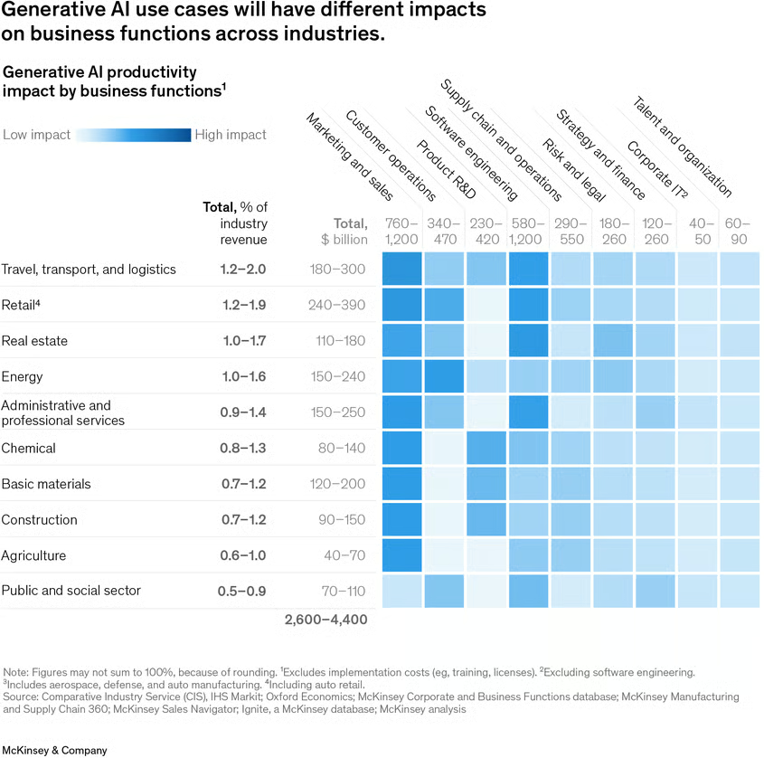
Financial services based on the information technology are experiencing their boom, though the specialists agree that it’s just the beginning. In the last year, only in the United States there has been a significant increase in the revenue of the fintech companies, even reaching the impressive 43% in reference to the prior year which translates into an incredible growth by 12.4 billion dollars. All it tookwas one year.
Not only are the modern solutions simpler, more comfortable and safer than those which previous generations got used to, but they are also far more personalized and nicer to use. It’s the app interfaces,credit cards and modern solutions which are meticulously prepared and tailored for the needs of the present-day user which stand behind the successes of the popularity of fintechs like “Revolut” or “N26Wygoda”.
It’s the comfort and the elegance of the utility which triumphed even over the superstitions against the payment with our phones. The fintechs have shown us a different way and they made a basis for a better standard.
Demands of the spoiled Millennials... or the visionary call for a change?
Together with the development of the modern technologies, the demands of the users of mobile devices have increased. We can criticize the current generation of young adults for being too reliant onpersonal comfort, but we can conjointly agree that their cries for an improvement has benefited us all. Online banking and payment systems have stopped being only utility based; they have become an aesthetic and enjoyable experience. We have reached a situation where the amount of savings on our credit card or the financial app is not the only signifier of prestige.
Thinking different about the UX/UI of financial services
Design is just the tip of an iceberg if its coincidental. Most companies need a fresh approach to create new products or improve the existing ones. Nothing illustrates it better than the Apple Card. When weare holding the card in our hands, we realise that its visually appealing and it has many interesting utilities, however this perception is too shallow.
It’s fascinating that Apple, unlike any other company is capable of doing the same thing so effectively. They combine known features without adding anything which is normally deemed necessary and then make a value proposition from it. The critics look down upon the card, saying that it lacks the NFC service. However, the piece of titanium with Goldman Sachs sign written over it, was never meant to be used for the contactless payment. You need to use it in the hotels reception, show it after the luxurious meal in the restaurant. You will do that, despite receiving a lower cashback than by using a phone to pay. The companies underestimate the power of beauty and prestige behind their products. Apple has created a better card than any other company not because it was innovative, but because it’s a product tailored towards their very own customer. The company perfectly reads their own clients when it realises that their needs lie in the sensation and feel of the aesthetic prestige.
Revolut – fintech technologies which molded the european market
One of the major pioneers that revolutionized the payment system is Revolut. Fintech was introduced to the Polish market in 2017 and it definitely won the hearts of our countrymen. While the banks are swearing that everything is under their control, the start-up has announced that they reached their first million of clients.
After the introduction of Revolut, many of the comforts it offered were revolutionary in Polish perception. Suddenly, we started using the foreign currency accounts which always used the beneficialconversion rates. Creating a new bank account suddenly became a cakewalk, unlike what was offered by our native banks, because of the well-rounded, neatly organised UI and UX of the app. The verification process is swiftly handled by the KYC procedures; thanks to them it took only one evening for our account to be made. The card arrived to the recipient only after a few business days. All without the damaged envelopes and redundant terms of service written in an unidentified legal terminology. All it took was a simple, elegant container which reminded the recipient of the Apple designs. Simplicity and enjoyment was the key, unlike the wonky CX (Customer Experience) of the bank accounts.
In the first half of 2018 there were 1.7 million financial start up clients and after only a year the number has grown to almost 4 million.
UX/UI design lessons from the Revolut
The advantage of Revolut wasn’t solely made by the ease of account creation or the free card distribution. Its success was decided by well thought and planned design. The clear and easy to read login screen (which can be unlocked by the usage of fingerprints or the personal code), easily readable main page and intuitive marking, everything is in touch with the key rules of UI design. The user is not distracted by the unnecessary visual elements. Big, contrasting key icons lead you to the most important functions such as making a wire transfer or checking the transaction story. What’s important is that Revolut has designed his app around the responsive grid which is following the rules of Material Design. It allows for optimal utilisation of the app no matter what resolution is allowed by the size of your mobile device.
It’s an art of designing a simple app. Revolut is minimalist but cosy and visually appealing, and unlike its rival apps it doesn’t come off as a cheap knock off. Even the simplest icon placement can make a huge difference in the art of designing the financial app
To design a newsletter
The communication with the clients is a cherry on top in establishing a good financial app. Bland, repetitive newsletters are often soulless automated responses which are sent to thousands of clients. Adaptation to the newest trends in the field of effective marketing allowed fintech to create an illusion that it doesn’t have to be that way. Its not a handwritten letter, but enough to keep the modern recipientengaged. Following the design notes of the app, we are faced with an easily readable, simple CTA, coherent design of keys or well refined microcopy. The elements are repeatable, which makes the user utilize the app instinctively after getting a hold of it. A coherent colour code reduces the reaction time to minimum. “Straight to the point”- this strategy of the brands language creates a sense of security, because the communication with the company feels sincere and accessible.
Fintech solutions in Polish banks
The trend was quickly picked up by our native banks. For the last several years they focused on optimising the payment procedures and the UX/UI of the mobile devices. Its not surprising as over 9 million of Poles have claimed that they are using the financial apps. However, finding the balance between the minimalism and utility of the interface is the biggest problem yet for the designers.
What is more, a well balanced app of the financial start-up or bank is that which is more readable and user friendly than native apps of the social medias. Now we are going to compare three methods of designing the UX and UI.
mBanks’ innovative mobile app
The clients usually do not take their time to time analyse the banking apps, unlike us of course. mBankcreated an app which, at first glance, meets all the modern design notes in the field of UI and UX.
Instead of trying to bombard the user with features, we receive clear section with consistent colouring. Not only can you easily make your money transfer, but also you can easily access the transaction story. The app is highly responsive on pretty much every single mobile device, the optimisation level will satisfy even the tablet users.
The most important icons are easily reachable by your thumb, they lie in a so-called “thumb zone”, which unfortunately isn’t the standard yet. The app was also designed on a clear grid, and the buttons generally follow the standard dimensions of 44x44 which is the size which is deemed the most comfortable to press on the screen.
There are two main reasons why you are clicking your banking app: to check your accounts’ balance and to make a money transfer. In mBank, the balance is the first, most visible element upon logging in.With only three quick clicks you can access the app and make your money transfer. The most important button which allows you to do so covers most of the space of the screen and has a bright, easily distinguishable colour.
PKO- world’s leading app design
If you want to insult a banker, tell him that the Polish banking system is out of touch and redundant. Consecutive competitions are proving that it’s just a harmful, slandering label. The IKO app which belongs to PKO Bank Polski was nominated as the best banking app... in the world! Twice in a row! This wondrous utility is used by almost 4 million people.
The tests easily show why the app is so highly regarded. A clear interface held in a toned down colour scheme allows you to access the most important functions without breaking a sweat.
The app takes full advantage of the technological advancements and innovation. Paying is made much easier because of the ability to scan a special code to make the transaction immediately. The IKO design doesn’t utilise micro interactions, animations and it doesn’t overwhelm the user with fancy decorations. However, this doesn’t mean the design is lacking in any way, the app was planned to be targeted at every eligible age group. The app is far more readable for the elderly age groups, because itcorresponds to the desktop version far more than any other banking app. Its apparent that mobile banking is not only used by the millennials.
The most commonly used functions, like making the money transfer were highlighted with a contrasting blue colour. The size of the buttons doesn’t suggest you the hierarchy of the choice of actions. Even before checking the app out, we suspected that it will have a standard hamburger menu, situated on the upper left corner. It’s a typical technique when we want to enforce a safe design which can be easily readable by every type of user
Credit Agricole, French elegance and... the very first dark mode
Messenger, iOS, Slack... each and every one of those app utilises the dark mode, which has become the leading standard in the design of the mobile apps. The mobile app of Credit Agricole follows a much different approach towards the design of UI than the IKO app. It’s much more different when compared to its desktop version.
Half-transparent buttons, elegant and minimalist design of the icons, micro interactions and micro animations all contribute to great enjoyment in learning and using the app. Of course at first its going to be a little puzzling for the older audience and the people who are less versed in the world of mobile goodies. The advanced features are hidden in the interface, so while the app seems simple, there is more than meets the eye here. What’s interesting, Credit Agricole doesn’t force the choice of options onto its user. The money transfer, transaction history or the recipient list icons have the same size and coloration. The most distinctive element of the hamburger menu is the “my products” options which isdeemed the most important and so it’s the easiest one to locate. However, the thumb-zone of the app islimited by the icons situated in the upper corner of the app. Had they been placed in the more accessible space, the app could be used entirely with your thumb.
Well designed UX/UI is a key to success!
intech is about to experience a very intense, yet productive period. We will be able to choose from many different ways of how to design the mobile apps revolving around the domain of banking. We will surely witness the rise of humble start-ups which are going to take the world of mobile banking bya storm. We will be capable of creating an enjoyable experience for millions of mobile users which will be tailored to their needs. We are faced with a chance of reimagining the once unpleasant chore of interaction with the bank into an enjoyable, easily accessible experience.
After all, designing a marvellous UX and UI is a part of designing a positive experience of any mobile user!
 en
en  pl
pl 


