Application born from frustration

Maciej Zieliński

11 Dec 2019
Application born from frustration
Julia Wolińska

Several dozen years ago, making purchases with a debit card was just a dream on the Polish market; without a wad of cash making a bigger transaction was futile. A dozen years ago, making a money transfer was preceded by a lengthy authorisation process. The frustration connected with a trip to one of the few available bank agencies was only surpassed by the one caused by standing in a long queue in a hospital. Several years ago, in order to pay while abroad, we needed to equip ourselves with a massive amount of cash in a currency exchange bureau. That is, unless we wished to face a costly currency conversion fees in the bank

How come then, that in a matter of several seasons we learned to uninstall payment apps if they do notfit our visual criteria? For banks and start-ups this is not a mere requirement, but a chance. The discussion concerning the “beauty contest” for the financial apps is more vivid than ever. UX (User Experience) and UI (User Interface) are bound to become a distinguishing factor in the era of PSD2 directive. Where does the success lie? Today, we are going to compare three different ways of designing the UX and UI in the financial apps.

The difference lies in the Fintechs

Financial services based on the information technology are experiencing their boom, though the specialists agree that it’s just the beginning. In the last year, only in the United States there has been a significant increase in the revenue of the fintech companies, even reaching the impressive 43% in reference to the prior year which translates into an incredible growth by 12.4 billion dollars. All it tookwas one year.

Not only are the modern solutions simpler, more comfortable and safer than those which previous generations got used to, but they are also far more personalized and nicer to use. It’s the app interfaces,credit cards and modern solutions which are meticulously prepared and tailored for the needs of the present-day user which stand behind the successes of the popularity of fintechs like “Revolut” or “N26Wygoda”.

It’s the comfort and the elegance of the utility which triumphed even over the superstitions against the payment with our phones. The fintechs have shown us a different way and they made a basis for a better standard.

Demands of the spoiled Millennials... or the visionary call for a change?

Together with the development of the modern technologies, the demands of the users of mobile devices have increased. We can criticize the current generation of young adults for being too reliant onpersonal comfort, but we can conjointly agree that their cries for an improvement has benefited us all. Online banking and payment systems have stopped being only utility based; they have become an aesthetic and enjoyable experience. We have reached a situation where the amount of savings on our credit card or the financial app is not the only signifier of prestige.

Thinking different about the UX/UI of financial services

Design is just the tip of an iceberg if its coincidental. Most companies need a fresh approach to create new products or improve the existing ones. Nothing illustrates it better than the Apple Card. When weare holding the card in our hands, we realise that its visually appealing and it has many interesting utilities, however this perception is too shallow.

It’s fascinating that Apple, unlike any other company is capable of doing the same thing so effectively. They combine known features without adding anything which is normally deemed necessary and then make a value proposition from it. The critics look down upon the card, saying that it lacks the NFC service. However, the piece of titanium with Goldman Sachs sign written over it, was never meant to be used for the contactless payment. You need to use it in the hotels reception, show it after the luxurious meal in the restaurant. You will do that, despite receiving a lower cashback than by using a phone to pay. The companies underestimate the power of beauty and prestige behind their products. Apple has created a better card than any other company not because it was innovative, but because it’s a product tailored towards their very own customer. The company perfectly reads their own clients when it realises that their needs lie in the sensation and feel of the aesthetic prestige.

Revolut – fintech technologies which molded the european market

One of the major pioneers that revolutionized the payment system is Revolut. Fintech was introduced to the Polish market in 2017 and it definitely won the hearts of our countrymen. While the banks are swearing that everything is under their control, the start-up has announced that they reached their first million of clients.

After the introduction of Revolut, many of the comforts it offered were revolutionary in Polish perception. Suddenly, we started using the foreign currency accounts which always used the beneficialconversion rates. Creating a new bank account suddenly became a cakewalk, unlike what was offered by our native banks, because of the well-rounded, neatly organised UI and UX of the app. The verification process is swiftly handled by the KYC procedures; thanks to them it took only one evening for our account to be made. The card arrived to the recipient only after a few business days. All without the damaged envelopes and redundant terms of service written in an unidentified legal terminology. All it took was a simple, elegant container which reminded the recipient of the Apple designs. Simplicity and enjoyment was the key, unlike the wonky CX (Customer Experience) of the bank accounts.

In the first half of 2018 there were 1.7 million financial start up clients and after only a year the number has grown to almost 4 million.

UX/UI design lessons from the Revolut

The advantage of Revolut wasn’t solely made by the ease of account creation or the free card distribution. Its success was decided by well thought and planned design. The clear and easy to read login screen (which can be unlocked by the usage of fingerprints or the personal code), easily readable main page and intuitive marking, everything is in touch with the key rules of UI design. The user is not distracted by the unnecessary visual elements. Big, contrasting key icons lead you to the most important functions such as making a wire transfer or checking the transaction story. What’s important is that Revolut has designed his app around the responsive grid which is following the rules of Material Design. It allows for optimal utilisation of the app no matter what resolution is allowed by the size of your mobile device.

It’s an art of designing a simple app. Revolut is minimalist but cosy and visually appealing, and unlike its rival apps it doesn’t come off as a cheap knock off. Even the simplest icon placement can make a huge difference in the art of designing the financial app

To design a newsletter

The communication with the clients is a cherry on top in establishing a good financial app. Bland, repetitive newsletters are often soulless automated responses which are sent to thousands of clients. Adaptation to the newest trends in the field of effective marketing allowed fintech to create an illusion that it doesn’t have to be that way. Its not a handwritten letter, but enough to keep the modern recipientengaged. Following the design notes of the app, we are faced with an easily readable, simple CTA, coherent design of keys or well refined microcopy. The elements are repeatable, which makes the user utilize the app instinctively after getting a hold of it. A coherent colour code reduces the reaction time to minimum. “Straight to the point”- this strategy of the brands language creates a sense of security, because the communication with the company feels sincere and accessible.

Fintech solutions in Polish banks

The trend was quickly picked up by our native banks. For the last several years they focused on optimising the payment procedures and the UX/UI of the mobile devices. Its not surprising as over 9 million of Poles have claimed that they are using the financial apps. However, finding the balance between the minimalism and utility of the interface is the biggest problem yet for the designers.

What is more, a well balanced app of the financial start-up or bank is that which is more readable and user friendly than native apps of the social medias. Now we are going to compare three methods of designing the UX and UI.

mBanks’ innovative mobile app

The clients usually do not take their time to time analyse the banking apps, unlike us of course. mBankcreated an app which, at first glance, meets all the modern design notes in the field of UI and UX.

Instead of trying to bombard the user with features, we receive clear section with consistent colouring. Not only can you easily make your money transfer, but also you can easily access the transaction story. The app is highly responsive on pretty much every single mobile device, the optimisation level will satisfy even the tablet users.

The most important icons are easily reachable by your thumb, they lie in a so-called “thumb zone”, which unfortunately isn’t the standard yet. The app was also designed on a clear grid, and the buttons generally follow the standard dimensions of 44x44 which is the size which is deemed the most comfortable to press on the screen.

There are two main reasons why you are clicking your banking app: to check your accounts’ balance and to make a money transfer. In mBank, the balance is the first, most visible element upon logging in.With only three quick clicks you can access the app and make your money transfer. The most important button which allows you to do so covers most of the space of the screen and has a bright, easily distinguishable colour.

PKO- world’s leading app design

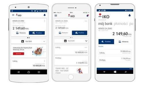
If you want to insult a banker, tell him that the Polish banking system is out of touch and redundant. Consecutive competitions are proving that it’s just a harmful, slandering label. The IKO app which belongs to PKO Bank Polski was nominated as the best banking app... in the world! Twice in a row! This wondrous utility is used by almost 4 million people.

The tests easily show why the app is so highly regarded. A clear interface held in a toned down colour scheme allows you to access the most important functions without breaking a sweat.

The app takes full advantage of the technological advancements and innovation. Paying is made much easier because of the ability to scan a special code to make the transaction immediately. The IKO design doesn’t utilise micro interactions, animations and it doesn’t overwhelm the user with fancy decorations. However, this doesn’t mean the design is lacking in any way, the app was planned to be targeted at every eligible age group. The app is far more readable for the elderly age groups, because itcorresponds to the desktop version far more than any other banking app. Its apparent that mobile banking is not only used by the millennials.

The most commonly used functions, like making the money transfer were highlighted with a contrasting blue colour. The size of the buttons doesn’t suggest you the hierarchy of the choice of actions. Even before checking the app out, we suspected that it will have a standard hamburger menu, situated on the upper left corner. It’s a typical technique when we want to enforce a safe design which can be easily readable by every type of user

Credit Agricole, French elegance and... the very first dark mode

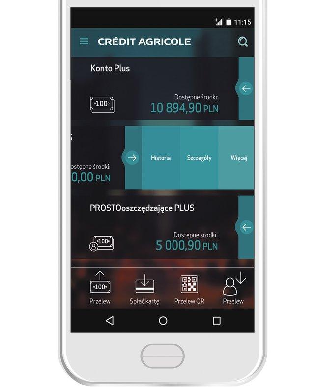
Messenger, iOS, Slack... each and every one of those app utilises the dark mode, which has become the leading standard in the design of the mobile apps. The mobile app of Credit Agricole follows a much different approach towards the design of UI than the IKO app. It’s much more different when compared to its desktop version.

Half-transparent buttons, elegant and minimalist design of the icons, micro interactions and micro animations all contribute to great enjoyment in learning and using the app. Of course at first its going to be a little puzzling for the older audience and the people who are less versed in the world of mobile goodies. The advanced features are hidden in the interface, so while the app seems simple, there is more than meets the eye here. What’s interesting, Credit Agricole doesn’t force the choice of options onto its user. The money transfer, transaction history or the recipient list icons have the same size and coloration. The most distinctive element of the hamburger menu is the “my products” options which isdeemed the most important and so it’s the easiest one to locate. However, the thumb-zone of the app islimited by the icons situated in the upper corner of the app. Had they been placed in the more accessible space, the app could be used entirely with your thumb.

Well designed UX/UI is a key to success!

intech is about to experience a very intense, yet productive period. We will be able to choose from many different ways of how to design the mobile apps revolving around the domain of banking. We will surely witness the rise of humble start-ups which are going to take the world of mobile banking bya storm. We will be capable of creating an enjoyable experience for millions of mobile users which will be tailored to their needs. We are faced with a chance of reimagining the once unpleasant chore of interaction with the bank into an enjoyable, easily accessible experience.

After all, designing a marvellous UX and UI is a part of designing a positive experience of any mobile user!

Most viewed


Never miss a story

Stay updated about Nextrope news as it happens.

You are subscribed

Token Engineering Process

Kajetan Olas

13 Apr 2024
Token Engineering Process

Token Engineering is an emerging field that addresses the systematic design and engineering of blockchain-based tokens. It applies rigorous mathematical methods from the Complex Systems Engineering discipline to tokenomics design.

In this article, we will walk through the Token Engineering Process and break it down into three key stages. Discovery Phase, Design Phase, and Deployment Phase.

Discovery Phase of Token Engineering Process

The first stage of the token engineering process is the Discovery Phase. It focuses on constructing high-level business plans, defining objectives, and identifying problems to be solved. That phase is also the time when token engineers first define key stakeholders in the project.

Defining the Problem

This may seem counterintuitive. Why would we start with the problem when designing tokenomics? Shouldn’t we start with more down-to-earth matters like token supply? The answer is No. Tokens are a medium for creating and exchanging value within a project’s ecosystem. Since crypto projects draw their value from solving problems that can’t be solved through TradFi mechanisms, their tokenomics should reflect that. 

The industry standard, developed by McKinsey & Co. and adapted to token engineering purposes by Outlier Ventures, is structuring the problem through a logic tree, following MECE.
MECE stands for Mutually Exclusive, Collectively Exhaustive. Mutually Exclusive means that problems in the tree should not overlap. Collectively Exhaustive means that the tree should cover all issues.

In practice, the “Problem” should be replaced by a whole problem statement worksheet. The same will hold for some of the boxes.
A commonly used tool for designing these kinds of diagrams is the Miro whiteboard.

Identifying Stakeholders and Value Flows in Token Engineering

This part is about identifying all relevant actors in the ecosystem and how value flows between them. To illustrate what we mean let’s consider an example of NFT marketplace. In its case, relevant actors might be sellers, buyers, NFT creators, and a marketplace owner. Possible value flow when conducting a transaction might be: buyer gets rid of his tokens, seller gets some of them, marketplace owner gets some of them as fees, and NFT creators get some of them as royalties.

Incentive Mechanisms Canvas

The last part of what we consider to be in the Discovery Phase is filling the Incentive Mechanisms Canvas. After successfully identifying value flows in the previous stage, token engineers search for frictions to desired behaviors and point out the undesired behaviors. For example, friction to activity on an NFT marketplace might be respecting royalty fees by marketplace owners since it reduces value flowing to the seller.

source: https://www.canva.com/design/DAFDTNKsIJs/8Ky9EoJJI7p98qKLIu2XNw/view#7

Design Phase of Token Engineering Process

The second stage of the Token Engineering Process is the Design Phase in which you make use of high-level descriptions from the previous step to come up with a specific design of the project. This will include everything that can be usually found in crypto whitepapers (e.g. governance mechanisms, incentive mechanisms, token supply, etc). After finishing the design, token engineers should represent the whole value flow and transactional logic on detailed visual diagrams. These diagrams will be a basis for creating mathematical models in the Deployment Phase. 

Token Engineering Artonomous Design Diagram
Artonomous design diagram, source: Artonomous GitHub

Objective Function

Every crypto project has some objective. The objective can consist of many goals, such as decentralization or token price. The objective function is a mathematical function assigning weights to different factors that influence the main objective in the order of their importance. This function will be a reference for machine learning algorithms in the next steps. They will try to find quantitative parameters (e.g. network fees) that maximize the output of this function.
Modified Metcalfe’s Law can serve as an inspiration during that step. It’s a framework for valuing crypto projects, but we believe that after adjustments it can also be used in this context.

Deployment Phase of Token Engineering Process

The Deployment Phase is final, but also the most demanding step in the process. It involves the implementation of machine learning algorithms that test our assumptions and optimize quantitative parameters. Token Engineering draws from Nassim Taleb’s concept of Antifragility and extensively uses feedback loops to make a system that gains from arising shocks.

Agent-based Modelling 

In agent-based modeling, we describe a set of behaviors and goals displayed by each agent participating in the system (this is why previous steps focused so much on describing stakeholders). Each agent is controlled by an autonomous AI and continuously optimizes his strategy. He learns from his experience and can mimic the behavior of other agents if he finds it effective (Reinforced Learning). This approach allows for mimicking real users, who adapt their strategies with time. An example adaptive agent would be a cryptocurrency trader, who changes his trading strategy in response to experiencing a loss of money.

Monte Carlo Simulations

Token Engineers use the Monte Carlo method to simulate the consequences of various possible interactions while taking into account the probability of their occurrence. By running a large number of simulations it’s possible to stress-test the project in multiple scenarios and identify emergent risks.

Testnet Deployment

If possible, it's highly beneficial for projects to extend the testing phase even further by letting real users use the network. Idea is the same as in agent-based testing - continuous optimization based on provided metrics. Furthermore, in case the project considers airdropping its tokens, giving them to early users is a great strategy. Even though part of the activity will be disingenuine and airdrop-oriented, such strategy still works better than most.

Time Duration

Token engineering process may take from as little as 2 weeks to as much as 5 months. It depends on the project category (Layer 1 protocol will require more time, than a simple DApp), and security requirements. For example, a bank issuing its digital token will have a very low risk tolerance.

Required Skills for Token Engineering

Token engineering is a multidisciplinary field and requires a great amount of specialized knowledge. Key knowledge areas are:

  • Systems Engineering
  • Machine Learning
  • Market Research
  • Capital Markets
  • Current trends in Web3
  • Blockchain Engineering
  • Statistics

Summary

The token engineering process consists of 3 steps: Discovery Phase, Design Phase, and Deployment Phase. It’s utilized mostly by established blockchain projects, and financial institutions like the International Monetary Fund. Even though it’s a very resource-consuming process, we believe it’s worth it. Projects that went through scrupulous design and testing before launch are much more likely to receive VC funding and be in the 10% of crypto projects that survive the bear market. Going through that process also has a symbolic meaning - it shows that the project is long-term oriented.

If you're looking to create a robust tokenomics model and go through institutional-grade testing please reach out to contact@nextrope.com. Our team is ready to help you with the token engineering process and ensure your project’s resilience in the long term.

FAQ

What does token engineering process look like?

  • Token engineering process is conducted in a 3-step methodical fashion. This includes Discovery Phase, Design Phase, and Deployment Phase. Each of these stages should be tailored to the specific needs of a project.

Is token engineering meant only for big projects?

  • We recommend that even small projects go through a simplified design and optimization process. This increases community's trust and makes sure that the tokenomics doesn't have any obvious flaws.

How long does the token engineering process take?

  • It depends on the project and may range from 2 weeks to 5 months.

What is Berachain? 🐻 ⛓️ + Proof-of-Liquidity Explained

Karolina

18 Mar 2024
What is Berachain? 🐻 ⛓️ + Proof-of-Liquidity Explained

Enter Berachain: a high-performance, EVM-compatible blockchain that is set to redefine the landscape of decentralized applications (dApps) and blockchain services. Built on the innovative Proof-of-Liquidity consensus and leveraging the robust Polaris framework alongside the CometBFT consensus engine, Berachain is poised to offer an unprecedented blend of efficiency, security, and user-centric benefits. Let's dive into what makes it a groundbreaking development in the blockchain ecosystem.

What is Berachain?

Overview

Berachain is an EVM-compatible Layer 1 (L1) blockchain that stands out through its adoption of the Proof-of-Liquidity (PoL) consensus mechanism. Designed to address the critical challenges faced by decentralized networks. It introduces a cutting-edge approach to blockchain governance and operations.

Key Features

  • High-performance Capabilities. Berachain is engineered for speed and scalability, catering to the growing demand for efficient blockchain solutions.
  • EVM Compatibility. It supports all Ethereum tooling, operations, and smart contract languages, making it a seamless transition for developers and projects from the Ethereum ecosystem.
  • Proof-of-Liquidity.This novel consensus mechanism focuses on building liquidity, decentralizing stake, and aligning the interests of validators and protocol developers.

MUST READ: Docs

EVM-Compatible vs EVM-Equivalent

EVM-Compatible

EVM compatibility means a blockchain can interact with Ethereum's ecosystem to some extent. It can interact supporting its smart contracts and tools but not replicating the entire EVM environment.

EVM-Equivalent

An EVM-equivalent blockchain, on the other hand, aims to fully replicate Ethereum's environment. It ensures complete compatibility and a smooth transition for developers and users alike.

Berachain's Position

Berachain can be considered an "EVM-equivalent-plus" blockchain. It supports all Ethereum operations, tooling, and additional functionalities that optimize for its unique Proof-of-Liquidity and abstracted use cases.

Berachain Modular First Approach

At the heart of Berachain's development philosophy is the Polaris EVM framework. It's a testament to the blockchain's commitment to modularity and flexibility. This approach allows for the easy separation of the EVM runtime layer, ensuring that Berachain can adapt and evolve without compromising on performance or security.

Proof Of Liquidity Overview

High-Level Model Objectives

  • Systemically Build Liquidity. By enhancing trading efficiency, price stability, and network growth, Berachain aims to foster a thriving ecosystem of decentralized applications.
  • Solve Stake Centralization. The PoL consensus works to distribute stake more evenly across the network, preventing monopolization and ensuring a decentralized, secure blockchain.
  • Align Protocols and Validators. Berachain encourages a symbiotic relationship between validators and the broader protocol ecosystem.

Proof-of-Liquidity vs Proof-of-Stake

Unlike traditional Proof of Stake (PoS), which often leads to stake centralization and reduced liquidity, Proof of Liquidity (PoL) introduces mechanisms to incentivize liquidity provision and ensure a fairer, more decentralized network. Berachain separates the governance token (BGT) from the chain's gas token (BERA) and incentives liquidity through BEX pools. Berachain's PoL aims to overcome the limitations of PoS, fostering a more secure and user-centric blockchain.

Berachain EVM and Modular Approach

Polaris EVM

Polaris EVM is the cornerstone of Berachain's EVM compatibility, offering developers an enhanced environment for smart contract execution that includes stateful precompiles and custom modules. This framework ensures that Berachain not only meets but exceeds the capabilities of the traditional Ethereum Virtual Machine.

CometBFT

The CometBFT consensus engine underpins Berachain's network, providing a secure and efficient mechanism for transaction verification and block production. By leveraging the principles of Byzantine fault tolerance (BFT), CometBFT ensures the integrity and resilience of the Berachain blockchain.

Conclusion

Berachain represents a significant leap forward in blockchain technology, combining the best of Ethereum's ecosystem with innovative consensus mechanisms and a modular development approach. As the blockchain landscape continues to evolve, Berachain stands out as a promising platform for developers, users, and validators alike, offering a scalable, efficient, and inclusive environment for decentralized applications and services.

Resources

For those interested in exploring further, a wealth of resources is available, including the Berachain documentation, GitHub repository, and community forums. It offers a compelling vision for the future of blockchain technology, marked by efficiency, security, and community-driven innovation.

FAQ

How is Berachain different?

  • It integrates Proof-of-Liquidity to address stake centralization and enhance liquidity, setting it apart from other blockchains.

Is Berachain EVM-compatible?

  • Yes, it supports Ethereum's tooling and smart contract languages, facilitating easy migration of dApps.

Can it handle high transaction volumes?

  • Yes, thanks to the Polaris framework and CometBFT consensus engine, it's built for scalability and high throughput.